
What's with the new forum update... The colors are ****ing my eyes


What's with the new forum update... The colors are ****ing my eyes
I am not sure if I like it or not. It sure is different.Originally Posted by EviBrooklyn

Sure is. It looks kind of amateurish to me (the banner at top, anyway) but whatever...
Besides the fact that the area to the post are more smaller instead of ocuppie all the window and the tables know, are so hard to read.
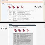
Look at this, this update is so anoyinng.
I saw the same thing on the OP ..... I want my familiar orange colour back .... I agree with Evi its hurting my eyes as well :/
Yeah these colors/ text size suck lol. I'm guessing this is a glitch.
I don't think its a glitch, it seems they changed the forum colors for their other games as well.
Yeah, it looks like a site-wide glitch... with the amateurish banner at the top...
The colours to me aren't hurting my eyes, what is hurting my eyes, is that they decided to deleted the table thing, reading a table with this new design is like an offence to anyone that has ever created an organized table, where the info for each round has the right space and the letters had the right size so it wasn't hard to the players to understand and the text was always the same size, we were the ones that could choose to put the letters smaller or bigger, the other thing they had done that is horrible, is the fact that they choose to put the space for the info more smaller and leaving blank space in the sides, what is something that shouldn't be done.
Last edited by cocauina; 03-03-15 at 06:18 PM.
glad I printed out the table before they changed it.
 Posting Permissions

 Reply With Quote